


Behinds the Scenes: The Guts Saga
A deep dive into the making of the Guts comics

Now that I’ve posted all the Guts comics, I thought I’d give you all a little peek behind the curtain and show you what went into the making of these comics.
Inception
The idea for these comics came from a trend I’ve seen across a lot of different webcomics where characters speak directly to their brain as if it’s a different character. Usually these conversations lead to some form of distress or inconvenience for the protagonist.
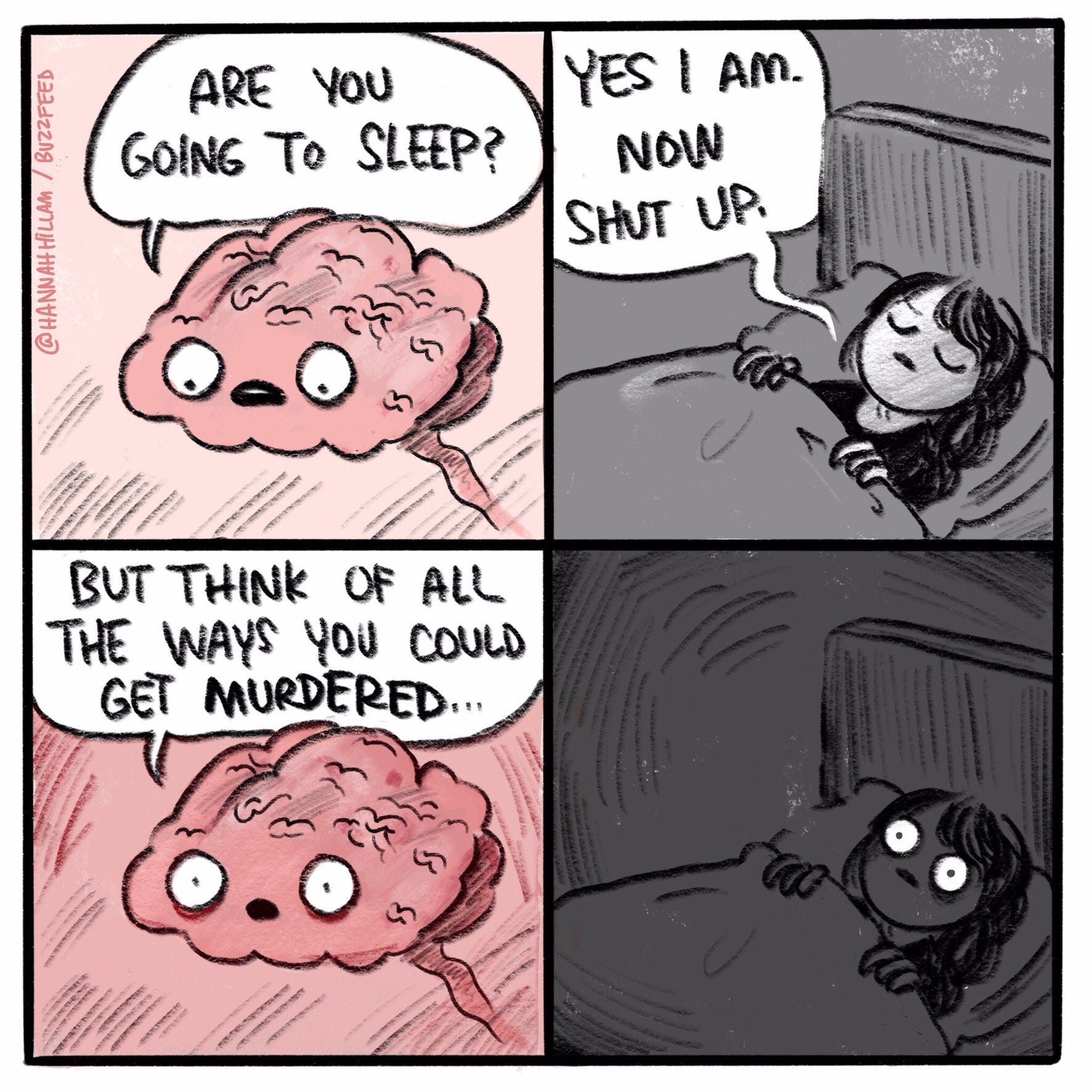
If you’ve been on the internet for any length of time in recent years you’ve probably seen this comic by Hannah Hillam memed to death.
A lot of comics in a similar vein get posted online. I remember a few years ago I would see some comic involving a person talking to their brain in some capacity get posted to Reddit every week. Much less often would I see comics about other organs. They certainly exist. Sarah Anderson has done some great comics about her uterus, for example, but brain comics are the ones I’ve come across the most by far.
Seeing these comics made me think: if the brain has its own mind and autonomy what about the other organs? What if they all had personalities, would they get along? This is what led to the idea for the Guts series.
Sketching
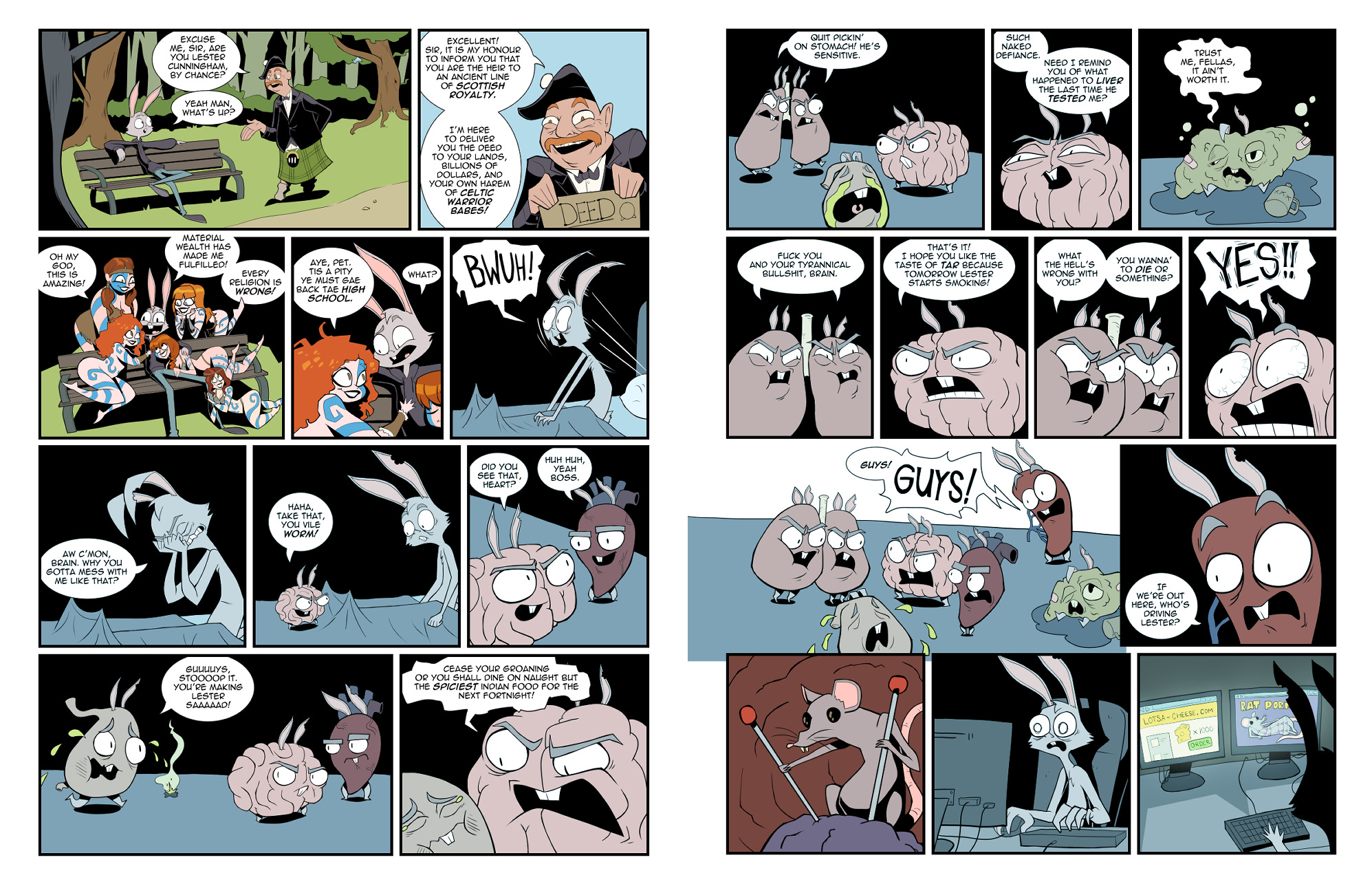
Once I decided to make a comic about organs I went about designing some. I made this comic about Lester’s guts because of all the characters in Feral Mills he has the most developed personality and internal conflict seems very “on brand” for him. Rather than just draw regular organs I gave them Lester’s ears and buck teeth to tie them closer to him design-wise.
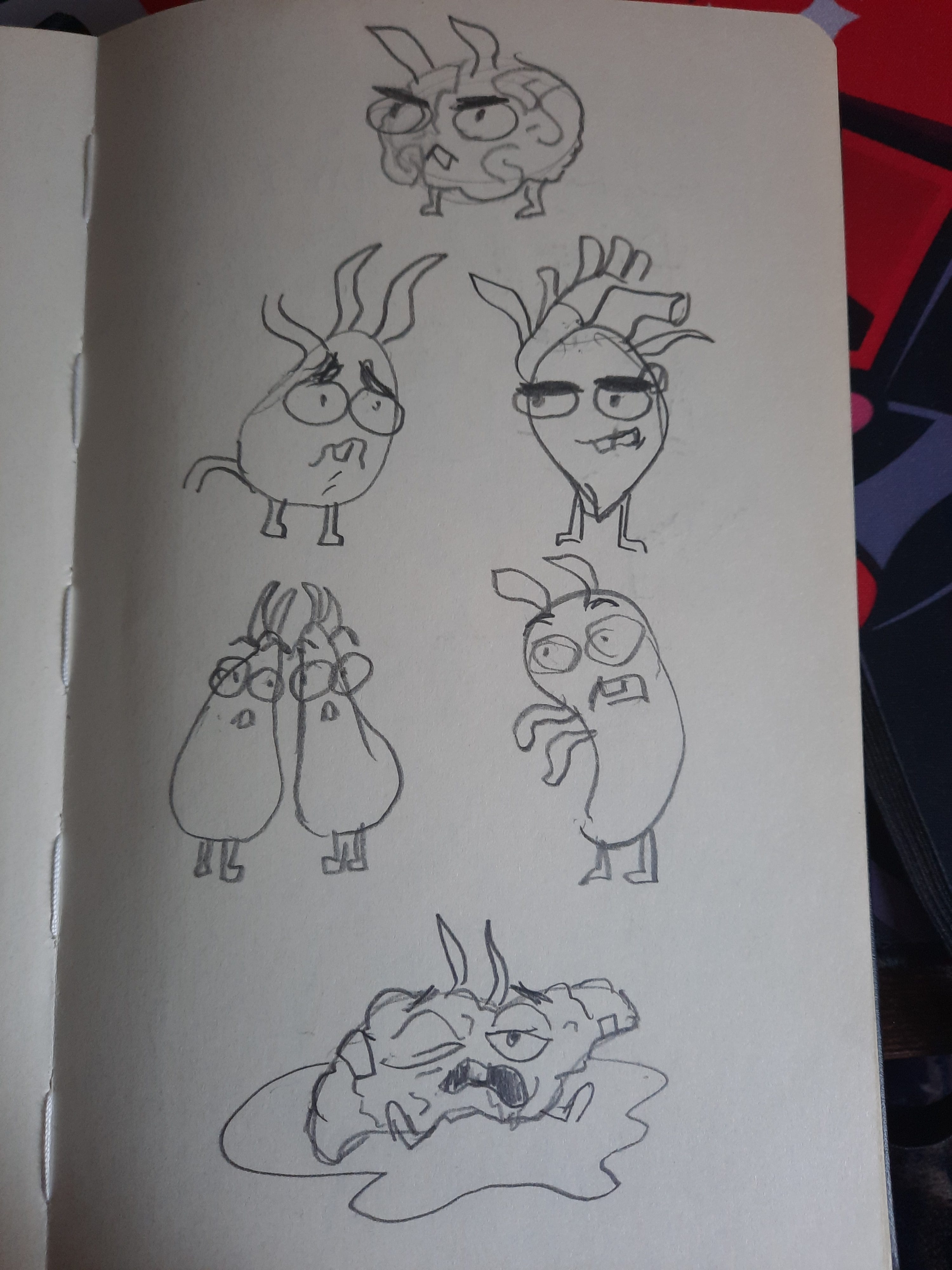
I initially picked out a few organs and assigned some personality traits. Brain was obviously the first, I wanted him to be sinister but have a certain eloquence in his speech. Heart was the natural second choice, he doesn’t talk much in the comic but I ended up making him a sort of dumb henchman-type figure. Stomach was another obvious one to include, I made him a crybaby. I chose the lungs to be the ones who stand up to Brain. Liver being a drunk felt like a no brainer. And I added Spleen in there because I needed someone outside of the argument to alert the others that Lester was missing. I considered including other organs (particularly, the colon, kidneys, and appendix) but ended up sticking with this group as to not make the whole thing too crowded.
Originally, Stomach’s and Heart’s roles were reversed, with Heart being the more sensitive one and Stomach being the goon, but I had a really bad stomach ache while I was planning the comic out and after that point it just seemed proper to switch their personalities.
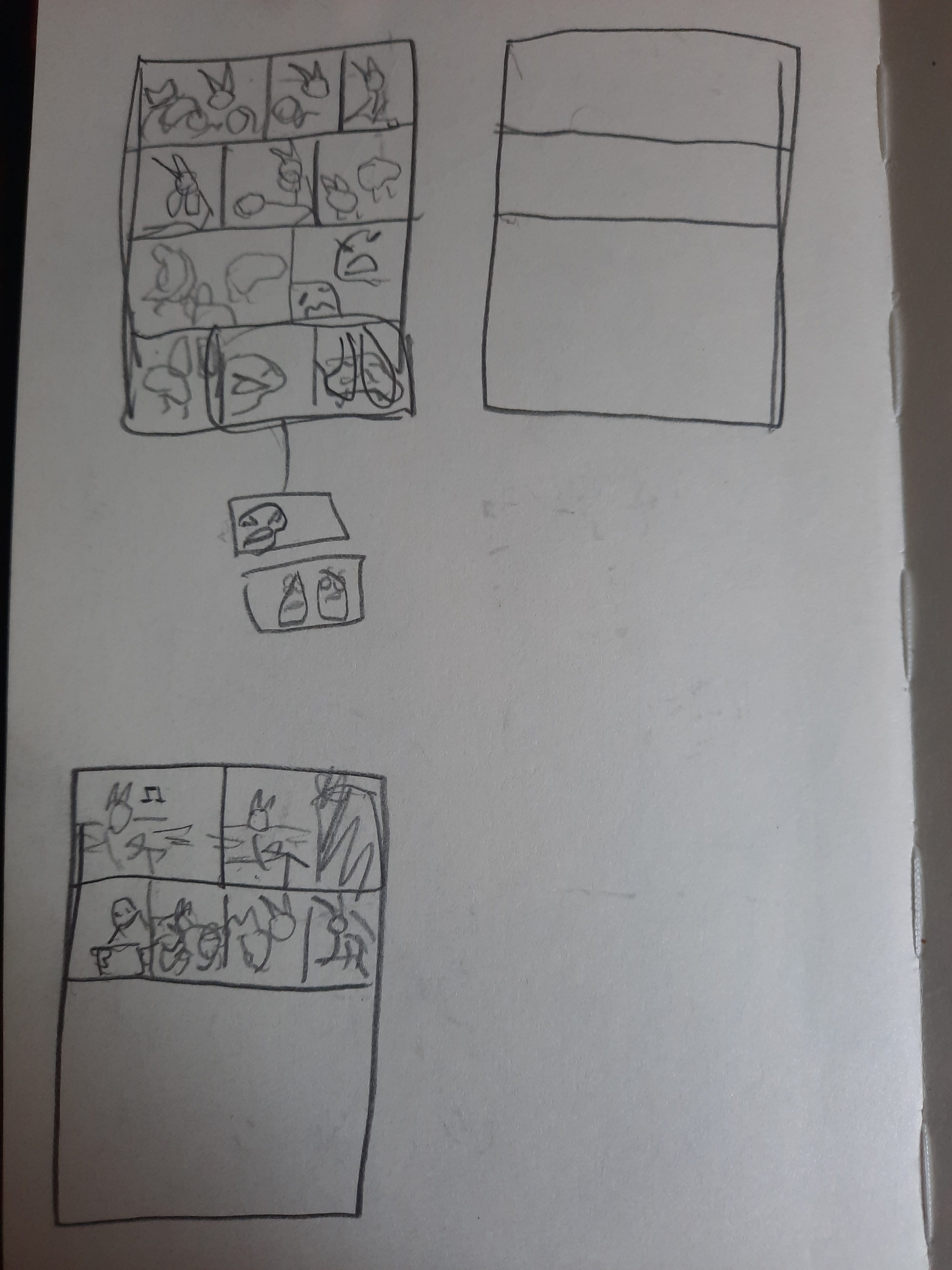
Once I had some rough designs for the organs I tumbnailed the idea out.
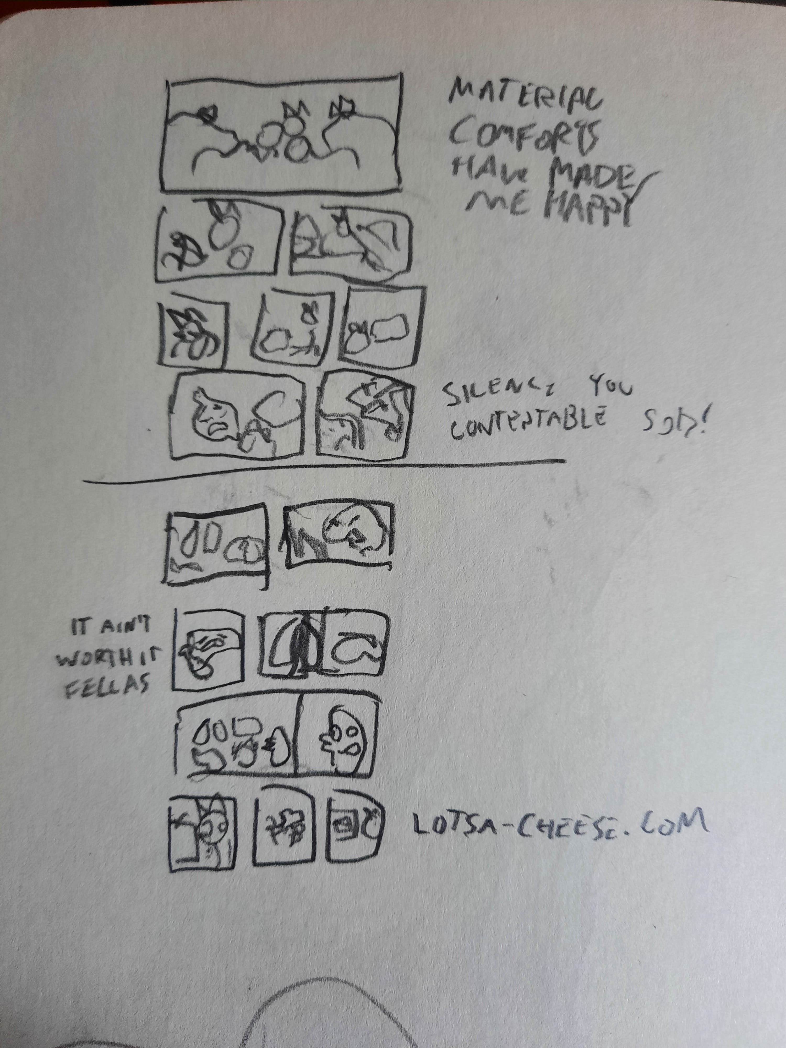
I don’t always thumbnail my ideas. These days I usually just go right into sketching in Clip Studio Paint but when I’m not sure how many pages I’ll need for a comic I’ll do some quick thumbnails. For this one I thought I might be able to do it in one page but it quickly became apparent it would be a multi-page endeavour.
There were a few attempts at thumblaining the whole thing out that I abandoned part way through before the idea solidified in my head.
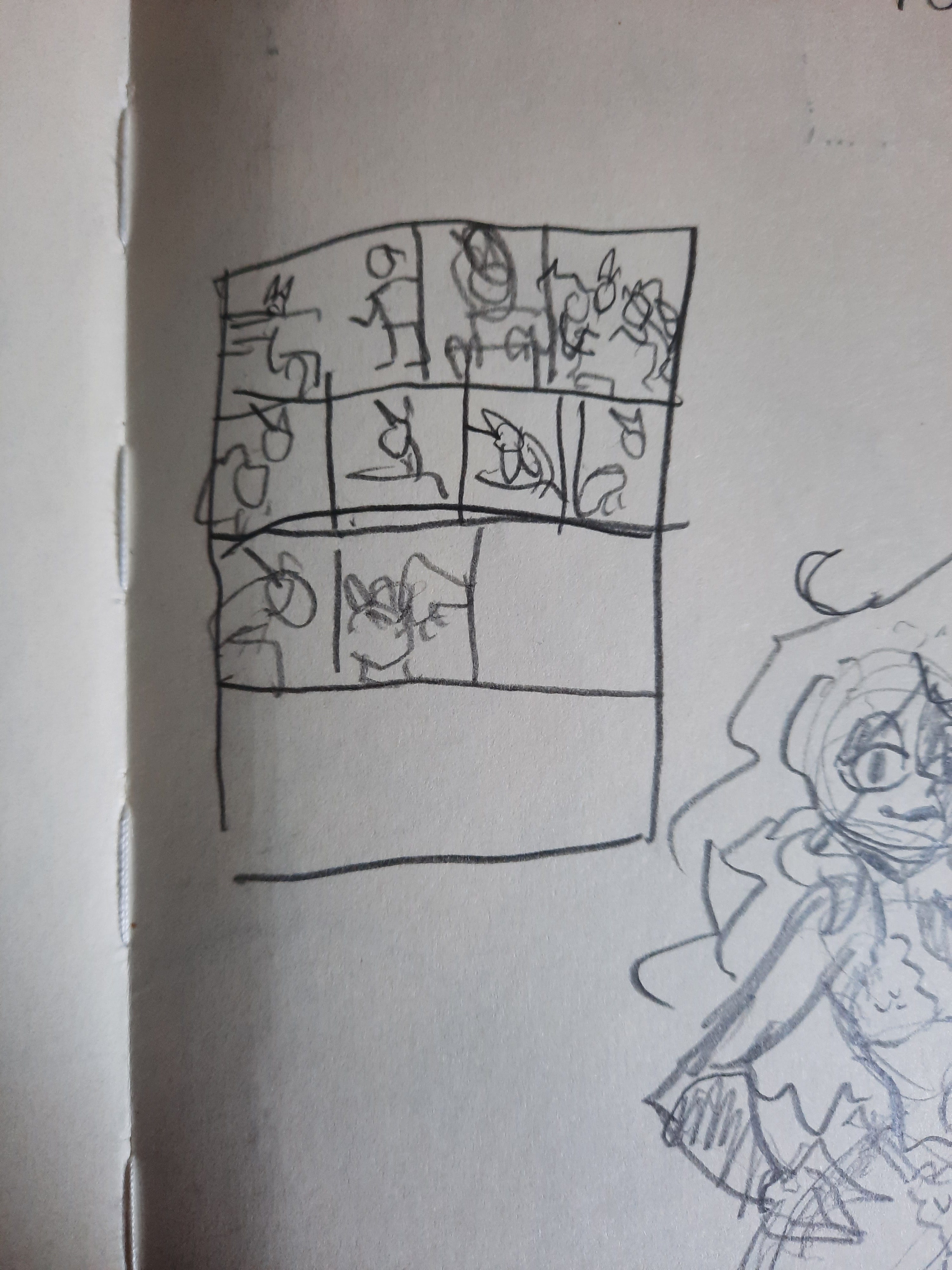
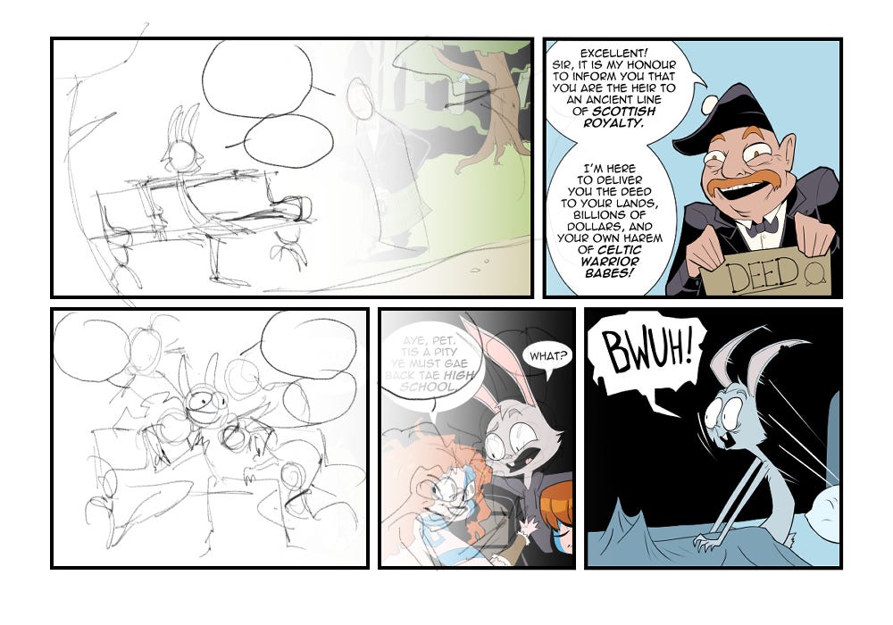
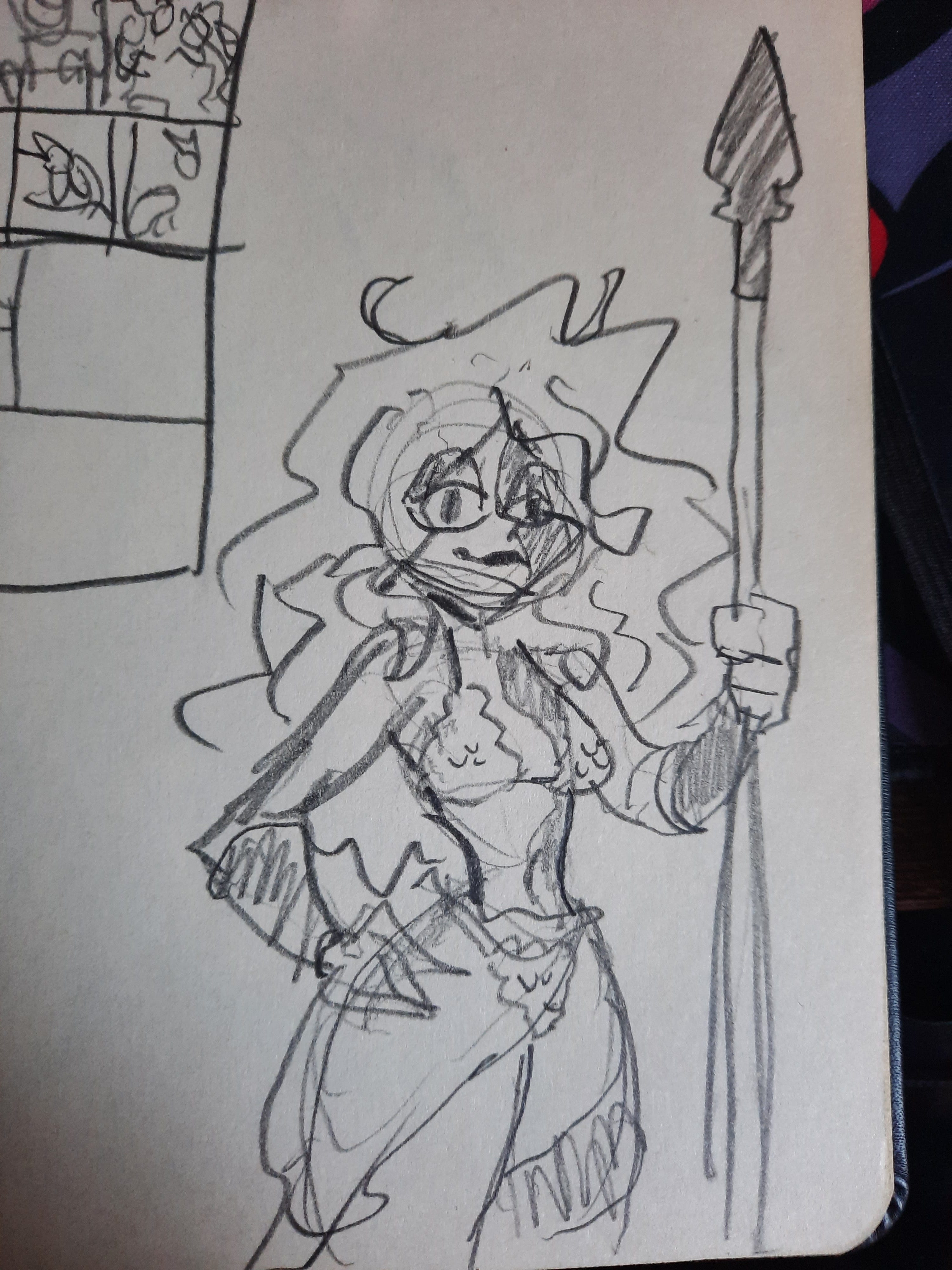
Originally the comic was going to start with just a big panel of Lester surrounded by money and women before being rudely awakened in the second panel. When I made the decision make this a two pager I drew out Lester’s dream sequence into its own strip. In this comic we learn that Lester’s last name is Cunningham so I decided he must have some sort of Scottish ancestry. As such, I thought it might be fun to tie his dream into that by making him dream about being the heir to some long lost line of Scottish royalty. Naturally, this afforded me the opportunity to draw scantily clad Celtic warrior women, as is my wont. I did only one sketch before deciding that was enough and moving on to the next step.
Layout
This is usually my first step in making a comic. In Clip Studio Paint I create the panels and rough out the whole thing with loose sketches to get an idea of composition and text placement. The idea at this stage isn’t to look pretty, I’m just getting the idea down so I can build something better on top of it.
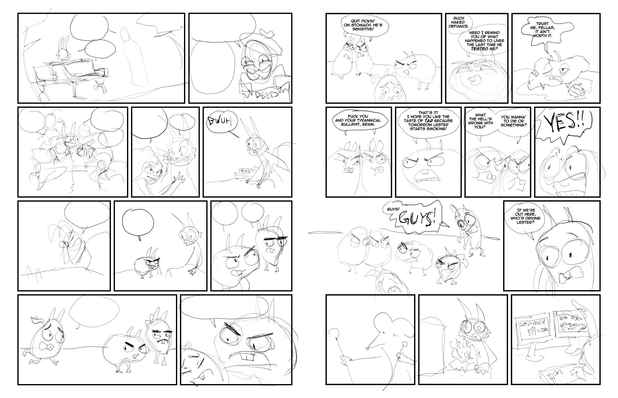
Frequently I think about getting rid of this step in the process and going to the pencilling phase straight away. I can’t seem to shake it off though. Feral Mills is a one-man operation so I do everything from writing to pencilling to inking to colouring and so on and so forth. I don’t write traditional comic scripts since there’s no need to describe my idea to another artist. As such, this step is more or less the “script” for my comic. I find it’s helpful to consider the art and writing as one from the get go so they don’t clash later down the line.
Penciling
After I finish the layout I move on to more refined drawings. Now I start concerning myself with what I actually want this thing to look like so I spend more time drawing everything out and making it look good.
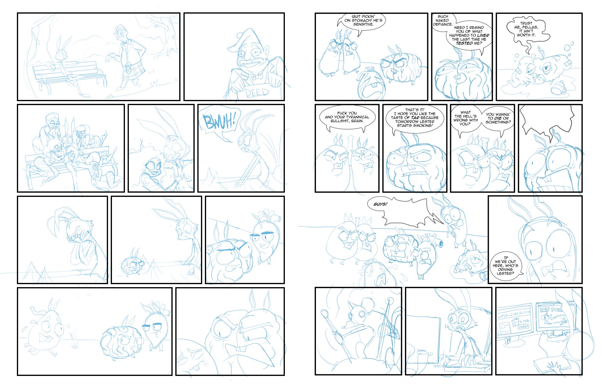
At this stage I set my digital pencil’s colour to some shade of blue. I do this so that when I go on to do the lineart I won’t confuse any of the blue pencil lines for the final ink lines. Why blue? No real reason. Before comics could be done digitally they were often drawn with a kind of blue lead that wouldn’t be picked up by scanners after the inks were applied. I do the pencils in shades of blue to imitate this but it could be done in any colour.
This is also where I nail down the design for any new or one-off characters in the comic. I was quite pleased with how the Celtic Warrior Babes turned out in this strip and am now bummed out that I won’t be able to use them again since they don’t actually exist within Feral Mills’ fictional universe. But they were fun to draw so I might do some one-off illustrations with them because, at the end of the day, none of this actually exists and there are no rules. Draw a hot Scottish chick. Tell your sister her baby’s ugly. Start a riot at your local town hall. No rules.
I put a few hints in the first few panels to indicate that Lester was dreaming. Most obviously, his left ear doesn’t have that iconic chunk bit out of it. In the first panel there’s also a blue bird hanging upside down in a tree in the background towards the right side of the composition.
Things are starting to look closer to how I want them at this stage but my pencils are still relatively loose. Again this is because I’m doing the next step instead of handing it off to someone else so I don’t need everything to be ultra tight since I know what I’m going for.
Inking
This is my favourite part of the process. The lineart is where I really start to see things come together and look like a finished comic.
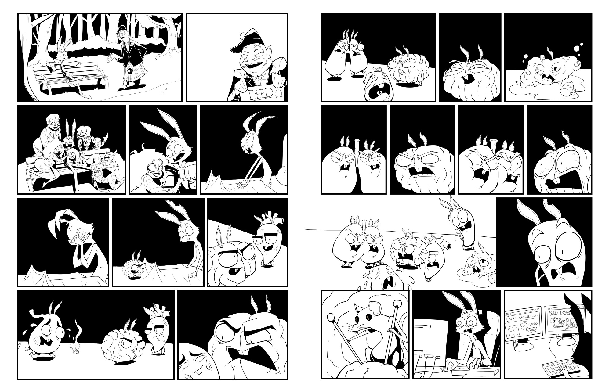
I like to slow down here and really concentrate on getting the lines right. I take a lot of pride in my line art so it’s the part of the process I tend to spend the most time on.
I like to use big patches of black for shadows. They’re great for drawing focus to certain parts of the composition and I love the moody feel it gives the finished product. Growing up, I drew a lot of influence from shows like Batman the Animated Series and artists like Mike Mignola and Frank Miller which led me in this direction.
Generally I do as much as I can at this stage. As a rule of thumb, I don’t move on to colouring unless I think the inking is good enough to be published on its own. I’ve often considered doing comics in just black and white because I find that stark contrast very striking. But since Feral Mills is a humour comic it just feels more appropriate to me to have it in colour.
Colouring
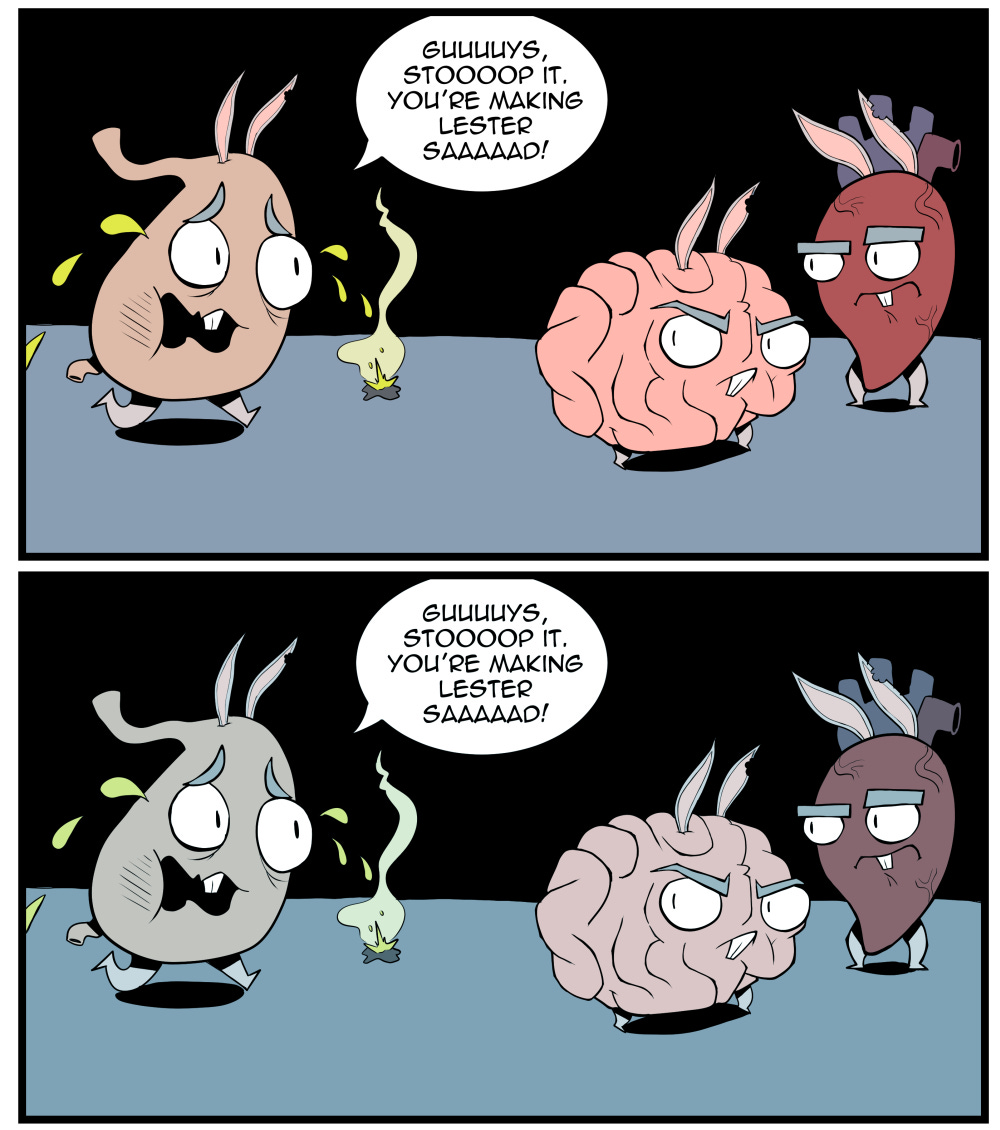
I keep things pretty simple here. Usually I’m just popping in flat colours and tweaking them to harmonize with each other but there are some other steps I take.
I’ll be honest, this is probably the stage of production I enjoy the least. I love the way it looks when it’s finished but the process of getting there can be a bit agonizing. This bugs me quite a bit. When I was in art school I remember always dreading having to colour my illustrations. I thought it always ruined them. What I didn’t realize was that I didn’t have the balance right. More and more I’m finding that you can get away with simpler colouring as long as you balance it out in some way. I’m able to do better drawings now because I know where my strengths lie and I can lean on those a bit more to make a good drawing. Sometimes I get compliments on my colouring and I’m always kind of taken aback because that’s where I feel I’m weakest. If my colours ever turn out well I think it’s for two reasons: one, I keep the colours simple and balance them out with nice lineart and shadows, and two, because I struggle and tweak the ever-loving crap out of them until I arrive at something I find acceptable.
For this comic one thing I did was add a colour layer above the panels that take place in Lester’s bedroom to give them a cooler feel. Since this takes place in the middle of the night I wanted the panels to feel darker without making them muddy or hard to parse out. Adding a colour layer was a simple solution that worked out well. I filled in every panel with the colours I would use for the characters if they were under a white light and then slapped on a colour layer filled with a light blue and reduced the opacity.
And that’s pretty much it!
Thanks for reading this deep dive into the making of the Guts saga, I hope you found it interesting. I try my best to preserve every step of my comics as I’m making them so if this is something you’d like to see more of in the future please let me know!